
Introducing BlackEdge - a brand that is all about unwavering commitment to their clients, providing them with sharp, innovative financial solutions designed for whatever entrepreneurship throws their way. Opportunity doesn't wait. True financial partnership means actively empowering you to act swiftly, allowing you to move forward with confidence and peace of mind. With an expanded array of services and a renewed focus on the unique aspirations of their clients, BlackEdge is here to be the trusted partner you need to achieve your goal.
In order for BlackEdge to claim "a new place in the world", we concluded that it must position itself as a provider of Neo Financial Services; a next-generation, agile financing brand that moves at the pace of modern reality. Its offering of creative, tech-enabled solutions is where standard bank products fall short, and precisely where The Edge lies. The core brand essence is
"giving credit to time" - framing the value of BlackEdge as financing time itself and delivering flexibility, room to maneuver, and financial calm.

Reality doesn’t wait. It demands that we stay in constant motion.In a world where every moment is a new opportunity, BlackEdge believes that the key to success is not to stop. Every step forward, even the smallest, brings you closer to the next goal.BlackEdge is here to speed up your journey, not slow it down. While others are stuck in bureaucracy, BlackEdge focuses on delivering the solutions that will let you keep moving.

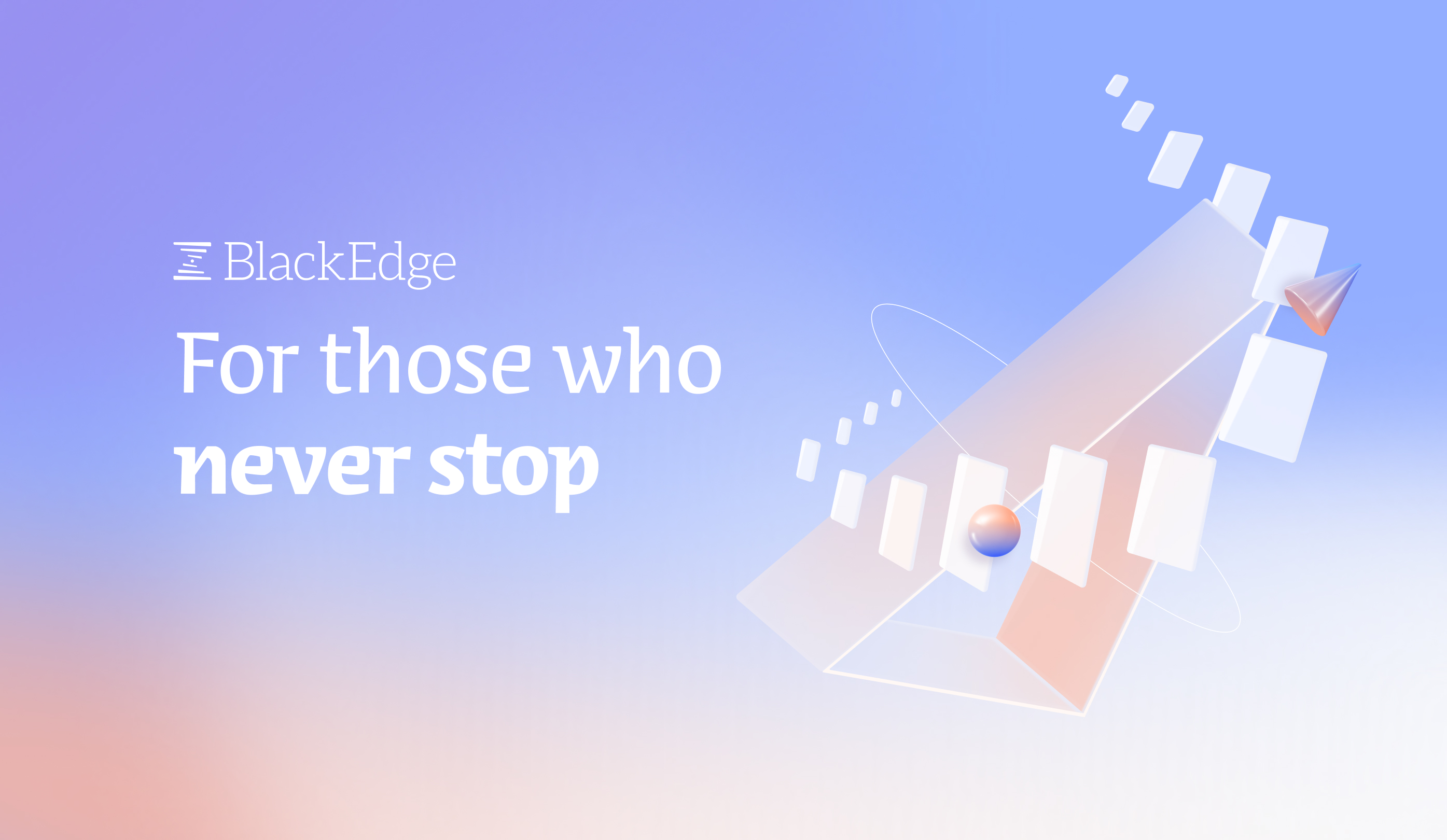
The logo is an expression of momentum; a graphic concept that illustrates the ambition moving us all forward, built layer by layer like a spiral staircase. BlackEdge is the central force that accelerates complex processes, the force that creates stability, and ensures that time is always working in your favor.
Taking inspiration from the world of Fintech, our goal was to create a website that sets BlackEdge apart from its competitors in terms of storytelling in a way that adheres to the brand values and is also compelling and engaging. With inclusivity in mind, we used a bilingual typeface for messaging in Hebrew and English and integrated it with the bespoke visuals crafted in the brand identity phase.