Tel Aviv University is the largest public research university in Israel. Every year, approximately 30,000 students study there across all programs and degree levels.
The Challenge
Multiple systems and a
cumbersome user experience
TAU students have many needs. The university offers various courses, activities, and services.
Each student has their own specific needs. In the current state, the website UX is cumbersome, overloaded, and largely irrelevant to the specific student using it.
Our main challenge was to distill the most important actions and information for each student and present them simply and intuitively.
The Solution
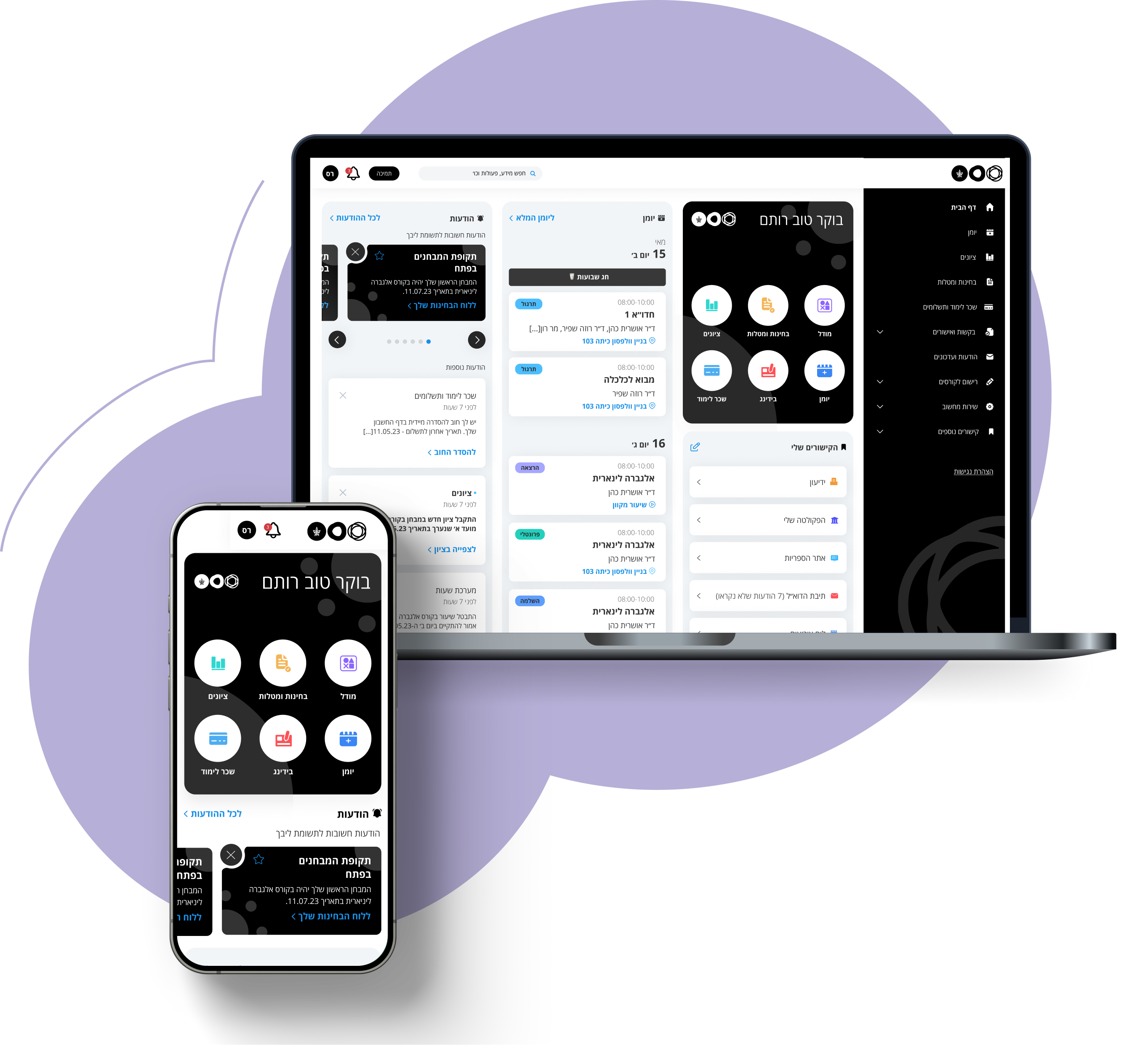
A unified, personalized view containing only the information and actions the student needs daily
We implemented this through a personal dashboard combining several features, enabling students to reach all their needs simply and intuitively.
The Process
1
Quantitative research -
survey
Distribution of a satisfaction survey to over 7,000 students to map initial pain points and main usages of university systems
2
Qualitative research -
interviews
In-depth interviews with students and stakeholders to map the existing UX - distilling needs, pain points, and opportunities
3
Comparative research -
benchmark
Review of websites and systems with similar characteristics to the student personal information portal
4
Concept development
Specification of the homepage and an additional area, creating information architecture - setting the framework for future development
5
From concept
to detailed MVP
Creating a design concept and visual language, detailed specification and design for the homepage and key areas (such as tuition and grades)
6
Continued system
expansion (ongoing)
Continued detailed specification and design of additional system areas and user types
What were the main insights from the research?
Poor communication
with students
Difficulty staying updated on important events and messages from the university
Difficulty finding contact details of relevant university staff
Multiple systems
Multiple entry points
Difficulty locating services scattered
across many systems
Missing a single place centralizing only what matters to students
Cumbersome user experience
Information overload and display of irrelevant content
Cumbersome navigation and unclear category division
Too many clicks to complete an action
Outdated and non-current interface
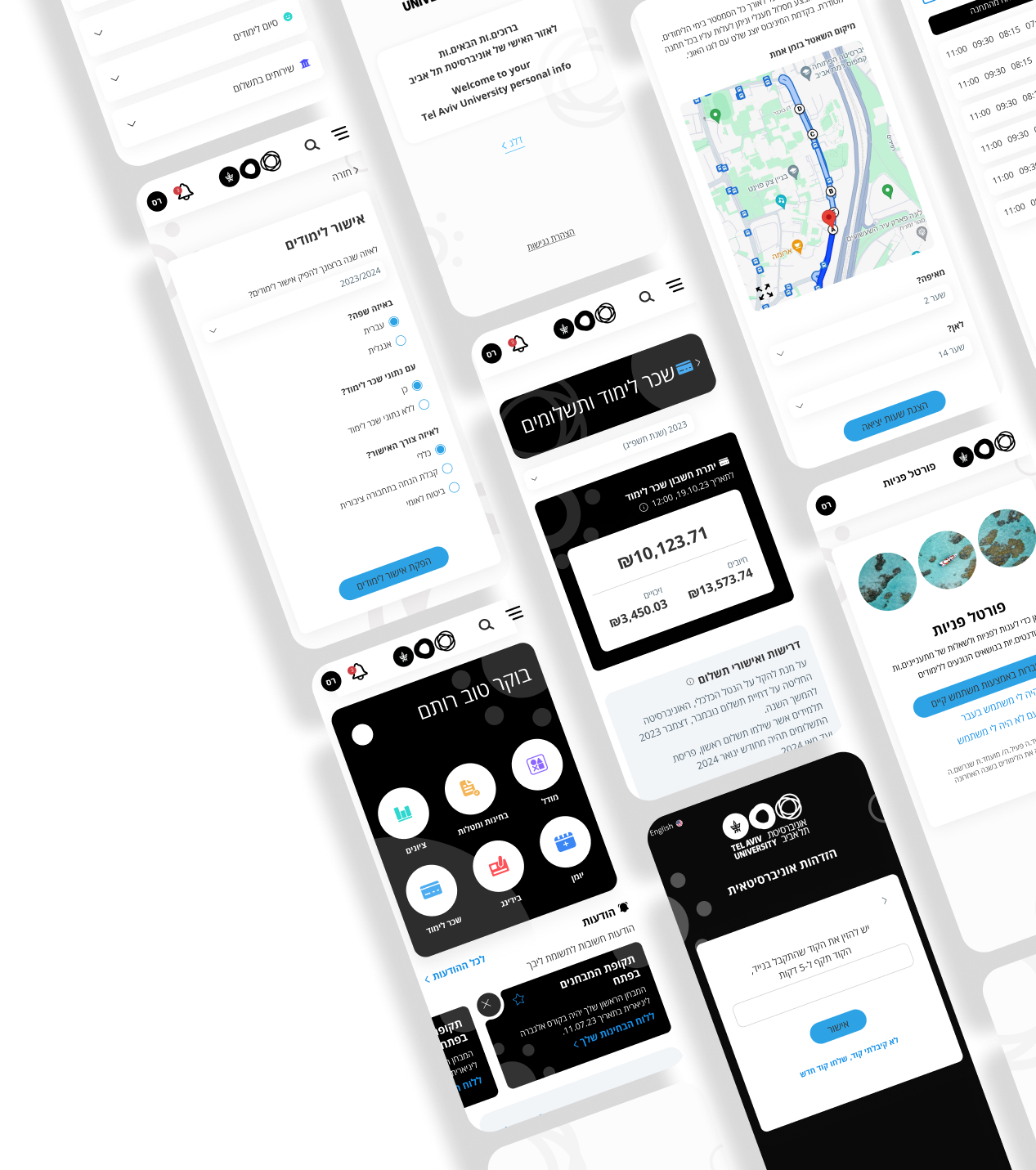
KEY FEATURES
1
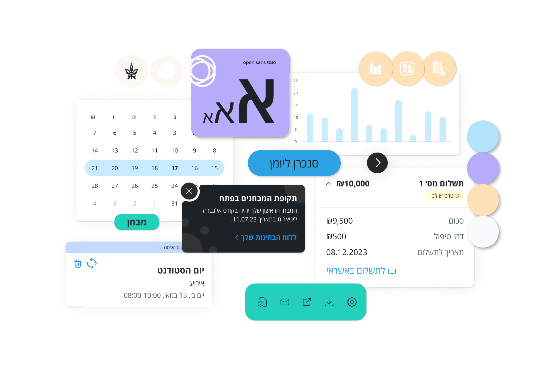
DASHBOARD
QUICK ACCESS TO COMMON ACTIONS / INFORMATION
An area that centralizes important topics in a prominent location to allow students quick access.
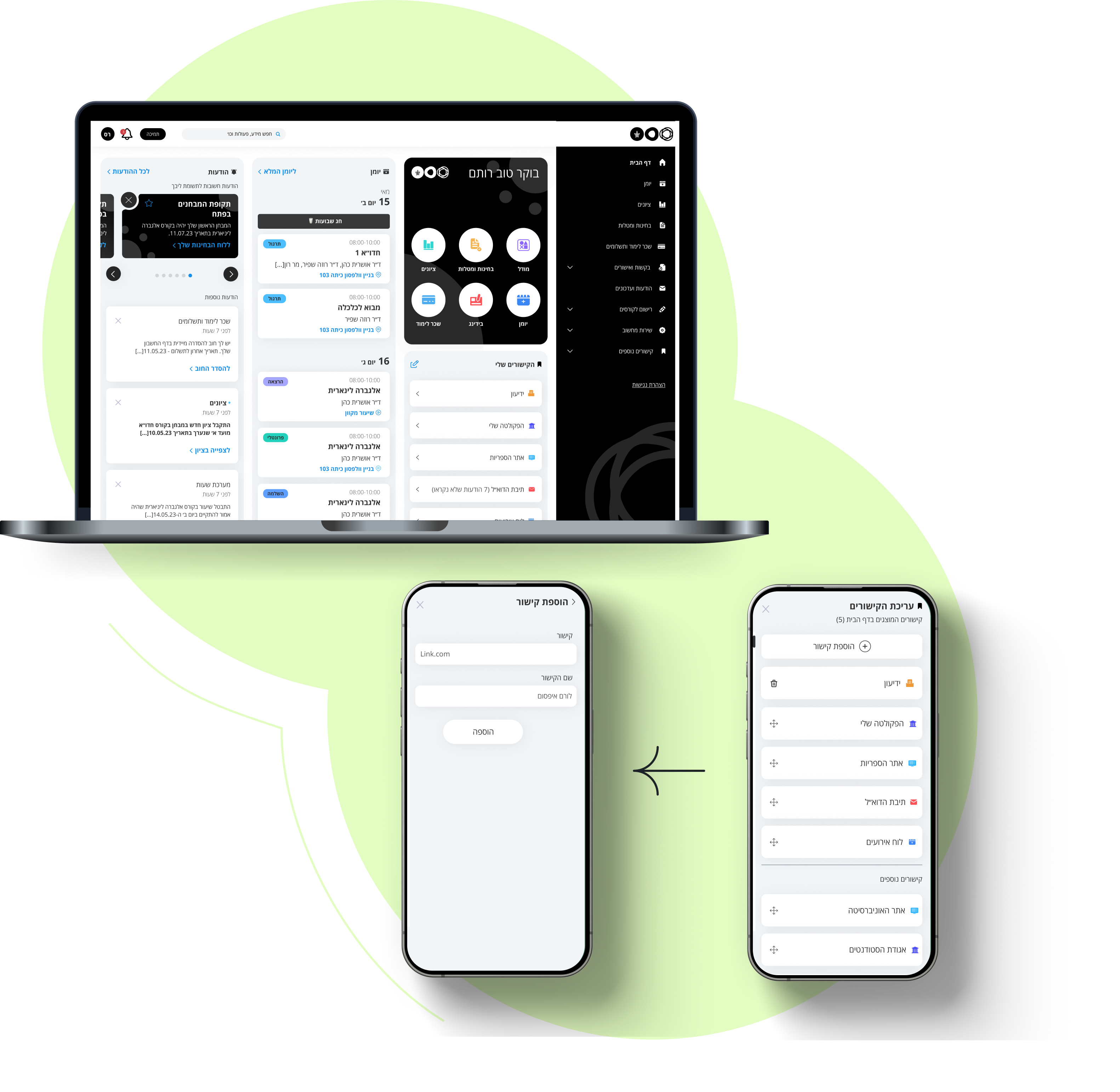
2
PERSONAL LINKS
EDIT AND ADD LINKS TO DISPLAY
Displaying common links in the front with the option to edit their display according to the students usage patterns. Additionally, the option to add a new university link by copying the URL and naming it.
3
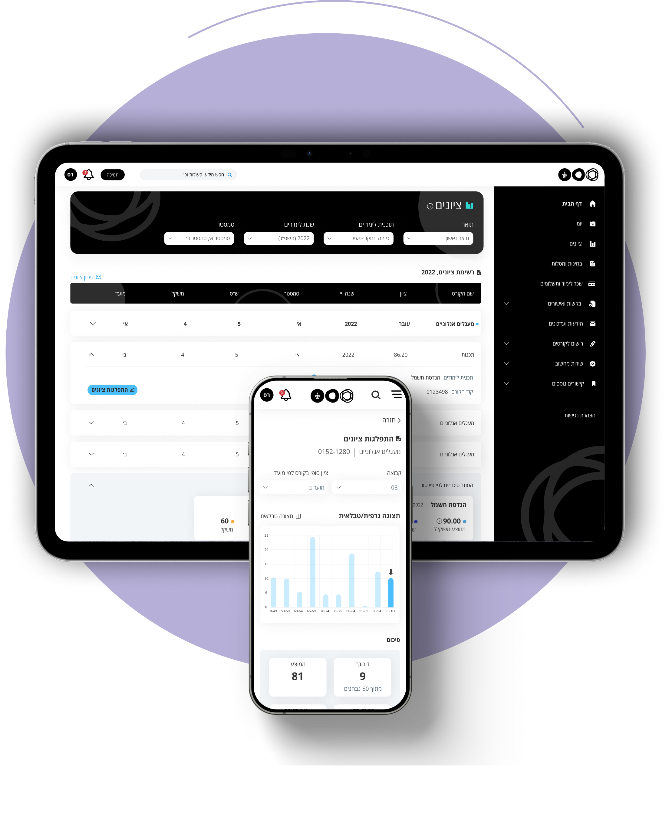
GRADES
TABLE WITH FILTERING / SORTING OPTIONS AND SUMMARY DISPLAY
Grades table with filtering and sorting as needed. Summaries by filter allow students to compare parameters by period (e.g., Year 1 vs Year 2 average) and view cumulative summaries.
4
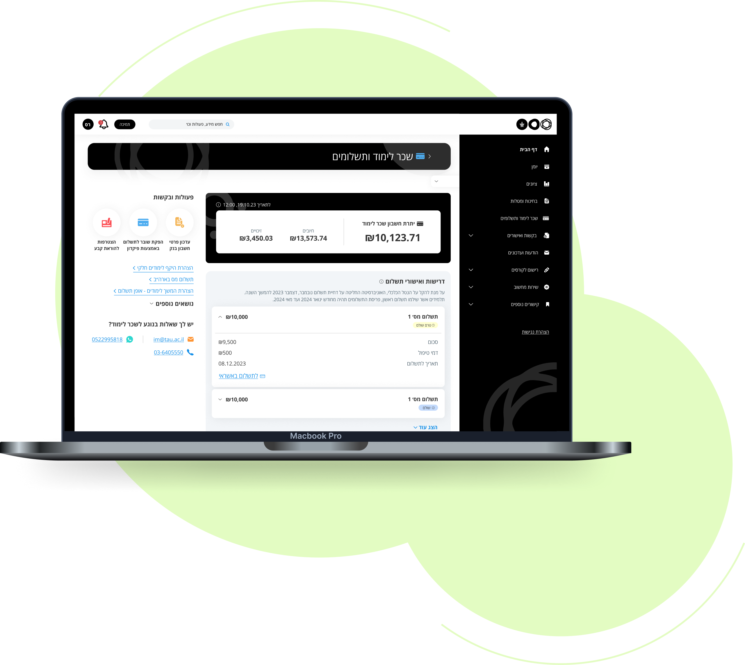
TUITION
CONSOLIDATION OF PAYMENT REQUIREMENTS, APPROVALS, AND DISPLAY OF CHARGES AND CREDITS
An account page showing how much remains to pay this year, centralizing all payment requirements and approvals in one place where payments can be made or approvals received. All account charges and credits are clearly displayed.
Wow, who's responsible for that?
Credits:
Client
Tel Aviv University
Services
User Research, User Flow Mapping, UX Design, UI Design